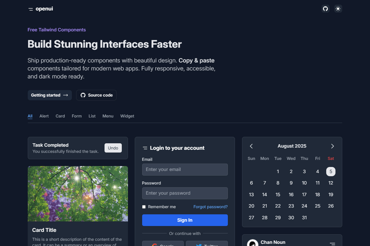
OpenUI provides a collection of production-ready, beautifully designed UI components built with Tailwind CSS. These components are fully responsive, accessible, and support dark mode.
Features
- 🚀 Fast Development - Copy & paste components to build stunning interfaces quickly.
- 🎨 Beautiful Design - Tailored for modern web apps.
- 🌗 Dark Mode Ready - Seamless dark mode support.
- ✅ Accessible & Responsive - Designed for all devices.
Getting Started
1. Clone the Repository
shellgit clone https://github.com/kimkorngmao/openui.git cd openui
2. Install Dependencies
shellnpm install
3. Run the Development Server
shellnpm run dev
Open http://localhost:3000 in your browser.
Project Structure
plaintextpublic/ ├── components/ │ ├── openui-Alert/ │ │ ├── 01.html │ │ ├── 02.html │ ├── openui-Card/ │ │ ├── 01.html │ ├── openui-List/ │ │ ├── 01.html │ │ ├── 02.html │ │ ├── 03.html pages/ ├── index.jsx
How It Works
- The index.jsx file reads all available components in
public/components
. - Components are displayed in a grid layout with copy-to-clipboard functionality.
- You can filter components by category.
Deployment
To deploy the project on Vercel, follow these steps:
- Install Vercel CLI:
shell
npm install -g vercel
- Run the deployment command:
shell
vercel
- Follow the prompts to complete the deployment.
Contributing
We welcome contributions! Feel free to submit issues or pull requests.
License
This project is licensed under the MIT License.
Author
Made with ❤️ by Korng